Member-only story
Beautify PowerBI Report — Shape Map with Mapbox and Customised data

This post is a continuation of this one: Beautify the PowerBI Reports — Maps, written two years ago. I haven’t explored the updated default Power BI map yet, but I still have the impression that it’s not visually appealing. That’s why I continue to use Mapbox, my favorite map API. Below is the shape map I created at the postal code level.
When you hover over the map, the customer count pops up. To create a map like this, there are three major steps:
- Set up Mapbox in Power BI
- Find the desired postal code boundary file (here, Australia’s postcode shapefile)
- Configure and update the map to reflect your data

1. Set Up Mapbox in Power BI
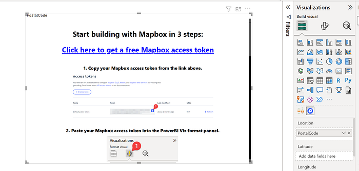
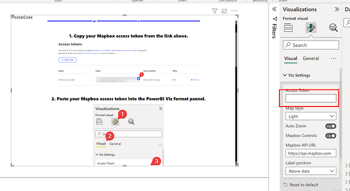
Add the 3rd party visuals, and configure your Mapbox token. The official instruction is clear shown as below.


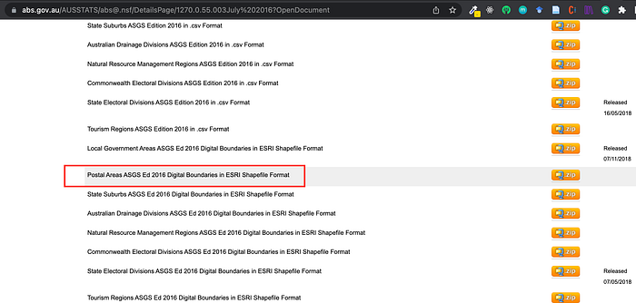
2. Find the Desired Postal Code Boundary File (Australia)
You can find the shapefile on the ABS (Australian Bureau of Statistics) website:Australian Statistical Geography Standard (ASGS): Volume 3 — Non ABS Structures, July 2016 . I’m not sure if a newer version is available, but postcodes tend to be fairly stable.

Once downloaded, extract the folder. You’ll see multiple files. To inspect the data visually, drop all the files except .xml into Mapshaper. The postal boundaries will be…

